40 Times Graphic Designers Made Logos So Bad You'd Want To Know What They Were Thinking Before Releasing It Online
Prepare to snort your morning coffee out of your nose as we unveil a gallery of the most side-splittingly absurd design fails known to humanity.
A famous quote among designers is by speaker and author Irene Au, who once said, “Good design is like a refrigerator – when it works, no one notices, but when it doesn’t, it sure stinks.” She wasn't kidding.
Remember those "easy open" packages? Those products that say "Tear Here," or "Pull Open?"
These things are a joke. They spend all this time, money, and energy thinking of packaging techniques when the consumer ends up having to use the scissors most of the time.
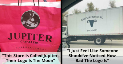
But bad designs aren't just limited to physical objects. They permeate our digital landscape, too.
Ever tried to navigate a website that feels like it was designed by a blindfolded chimp with a grudge against usability? You have to keep scrolling because the designer decided to put too much white space when it's not needed at all?
And they say it's all for the sake of sophistication and simplicity. They even want to make it futuristic.
And let's not forget about those user manuals written in a language that seems suspiciously similar to Martian. You might as well try deciphering ancient hieroglyphics for all the help they provide.
Well, we know you just want to be entertained. So, we've curated some of the most outrageous design fails shared online. Brace yourself for a wild ride through the world of design gone wrong.
 Reddit / unknown456
 Reddit / pizzalaat
 Reddit / GoatAndYourMum
 Reddit / cbigsby
 Reddit / cbigsby
 Reddit / OfficialDampSquid
 Reddit / mojavecourier
 Reddit / comicfitz
 Reddit / noahmilam
 Reddit /rowan954
 Reddit / flieckster
 Reddit / cj8tacos123
 Reddit / beasterne
 Reddit / Googlehai
 Reddit / GhostBetta
 Reddit / jordan460
 Reddit / kingtrash7
 Reddit / xEYoungx
 Reddit /Bossplot
 Reddit / kanye_euwest_
But at the very least, they all gave us a reason to laugh.
 Giphy
Giphy
These projects truly remind us that even the most well-intentioned creations can go hilariously awry. So, as we chuckle at these design fails, let's also appreciate the ingenuity behind their unintended comedy and strive for a future where every design leaves us smiling, not scratching our heads.
And if you want to make someone chuckle, why not spread the hilarity by sharing this post with them?