

40 Times Graphic Designers Made Logos So Bad You'd Want To Know What They Were Thinking Before Releasing It Online
These logos aren't just absurd, they're highly inappropriate in context
Hi there, lovers of logos! You might be wondering, though, how these awful logos came to be.
How they manage to get past marketing teams and into the public eye is even more perplexing. A lack of planning and research is typically a major factor in these logo failures.
A thorough understanding of the brand, its values, target market, market trends, and other related topics is necessary for a well-designed logo. It goes beyond simply producing something aesthetically beautiful - well, maybe not in the context of this post.
It's about producing something that truly captures the essence of the company and connects with its target audience. When these elements are ignored, the result is a logo that appears ludicrous or utterly out of place in the given situation.
Since everyone enjoys hilarious things, we genuinely hope you've had your recommended amount of coffee. Get ready for an exciting journey into the bizarre and absurd world of logo design fails.
Buckle up, as we're going to present some instances of designers who took the phrase "thinking outside the box" a bit too literally. As you scroll down below, you will see just the tip of the iceberg in terms of the logo failures, so keep scrolling and enjoy.
1. Don't Overthink This, It's Just A Handball Club Logo
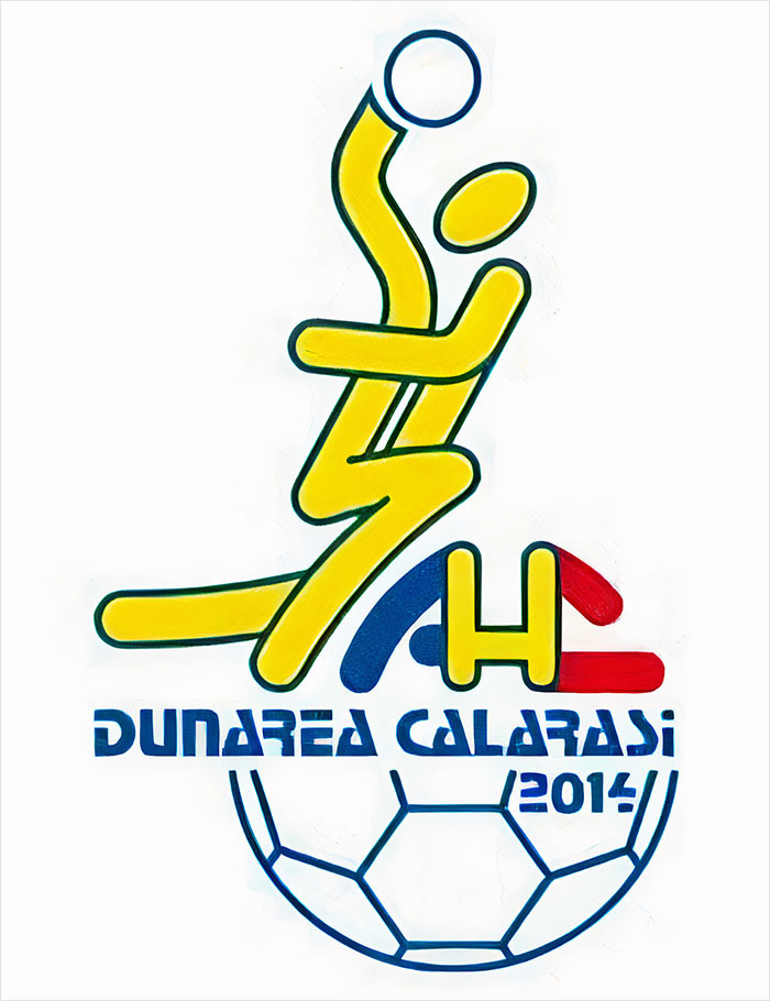 tarandfeathers
[ADVERTISEMENT]
2. This Bank Logo In My Hometown
 calumstevenson7
[ADVERTISEMENT]
3. This Horrific Logo
 reddit.com
[ADVERTISEMENT]
4. This Logo Of A Turkish Water Brand. It Obviously Sucks
 sercan35
[ADVERTISEMENT]
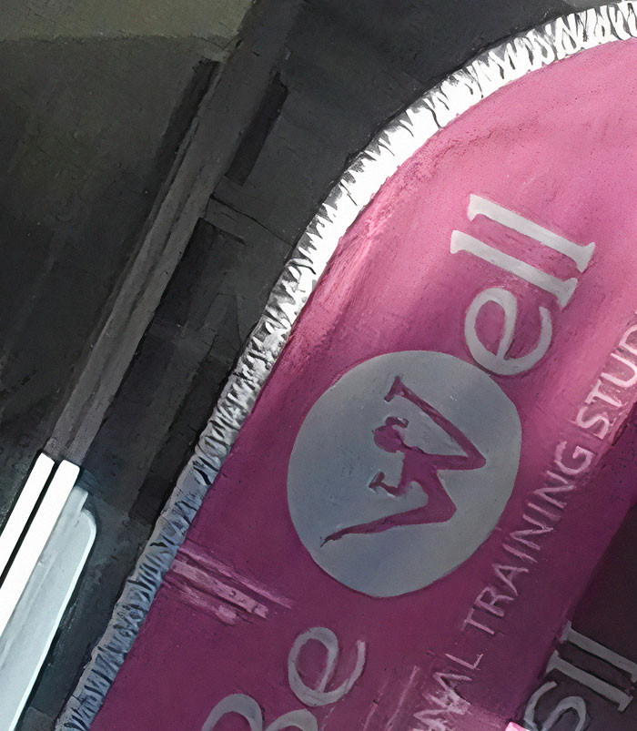
5. An Unfortunate Logo For A Fitness Center
 Dingwallace
[ADVERTISEMENT]
6. Russian Bread Company Logo. Literally Cra**y Design
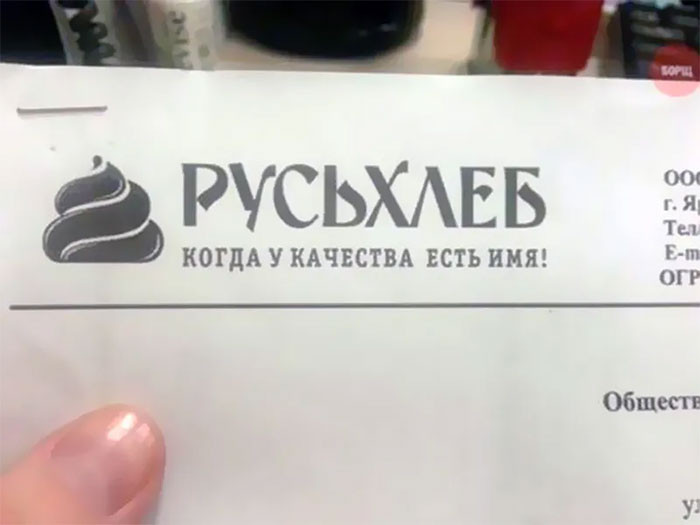 WildWasteland42
[ADVERTISEMENT]
7. They Really Need A New Logo
 ForeverInaDaze
[ADVERTISEMENT]
Of course, another reason for failure may be that the design was examined in a vacuum, not taking into account how it might be interpreted in the real world, or it could be that the people examining the logo are too involved in the undertaking to recognize possible issues. similar to when you work on something for so long that you start to feel stressed by it.
[ADVERTISEMENT]
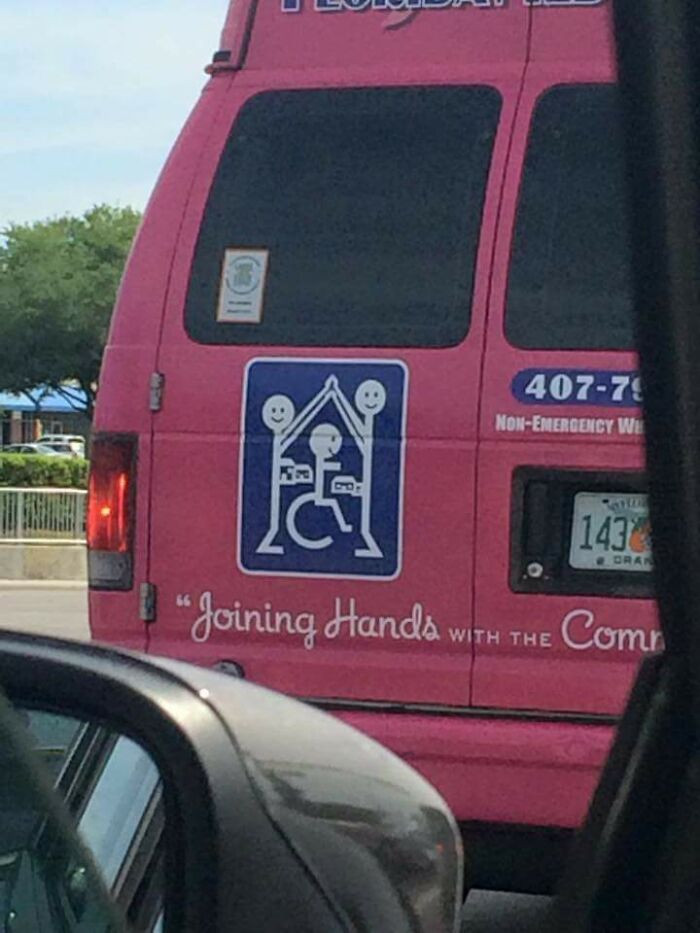
8. "Yes, A Hanged Family Would Make A Great Logo For Our Company"
 refeer
[ADVERTISEMENT]
9. This Dentist's Choice Of Logo Near My House
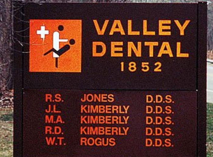 krukemeyer
[ADVERTISEMENT]
10. This Kids Society Logo... The Bullet Holes Are An Interesting Touch
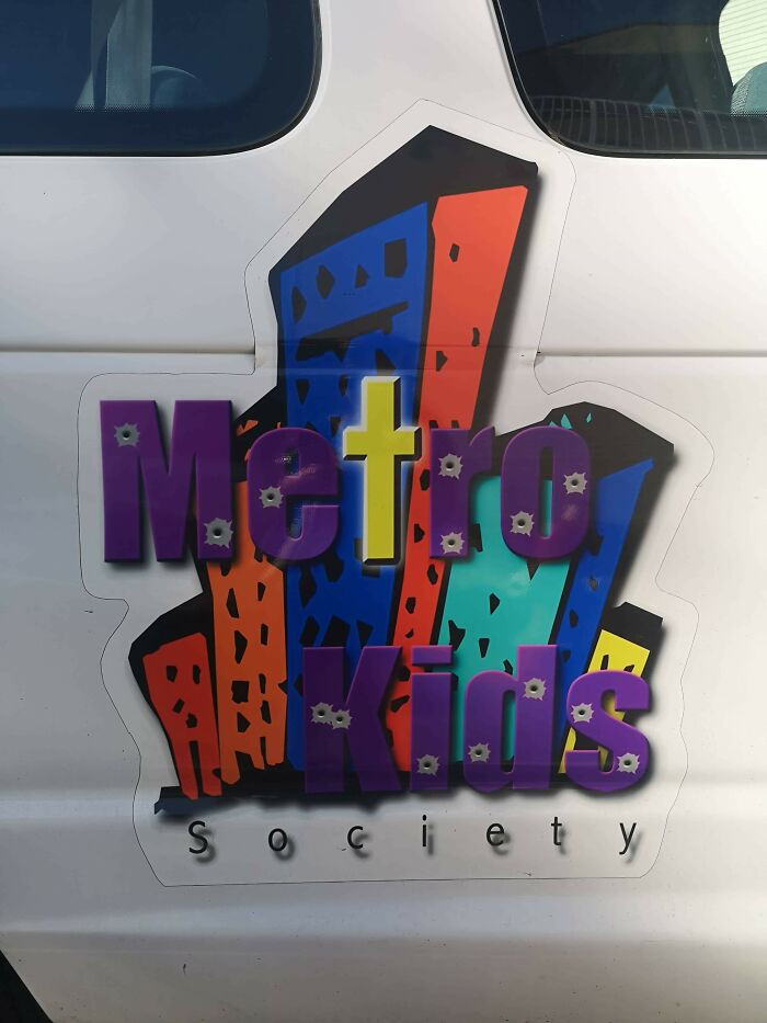 clarkj1988
[ADVERTISEMENT]
11. Quite A Bizarre Logo
 SupraPseudo
[ADVERTISEMENT]
12. Someone Paid Money For This To Be Their Sign And Logo/Mascot. I’m Convinced This Is Drug Lord’s Money Laundering Business
 SoDakZak
[ADVERTISEMENT]
13. This Church Near My House Should Probably Rethink Their Logo
 bcain204
[ADVERTISEMENT]
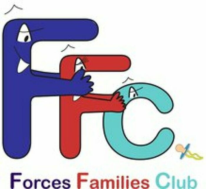
14. Unfortunate Placement Of The Facebook Logo
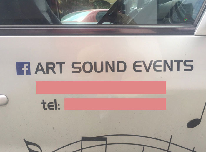 tanghel
15. My School's Logo Looks Like A Crying Face
 raviioli
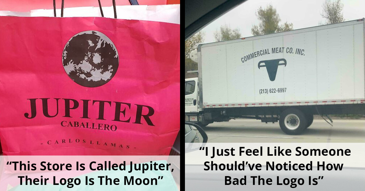
16. I Just Feel Like Someone Should’ve Noticed How Bad The Logo Is
 reddit.com
17. This Store Is Called Jupiter, Their Logo Is The Moon
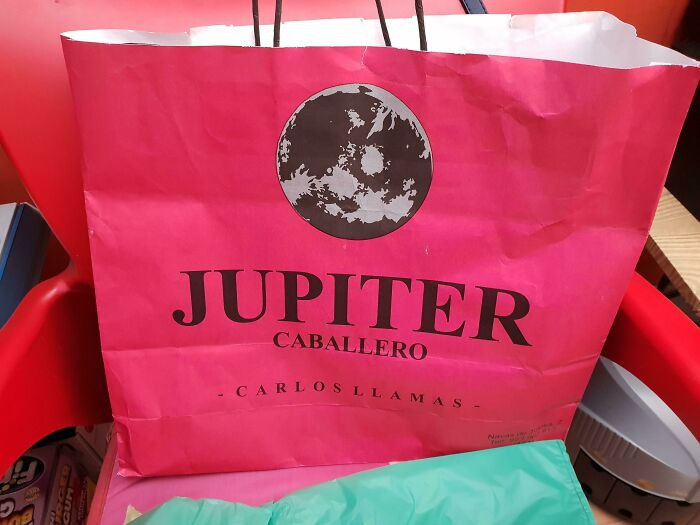 GaraMind
18. This New Sushi Restaurant Logo Has A Racist Cra*py Design
 MrsSanedunk
19. This Logo Design!!
 FaustoYoshihara
20. Then Why Use The Recyclable Logo?
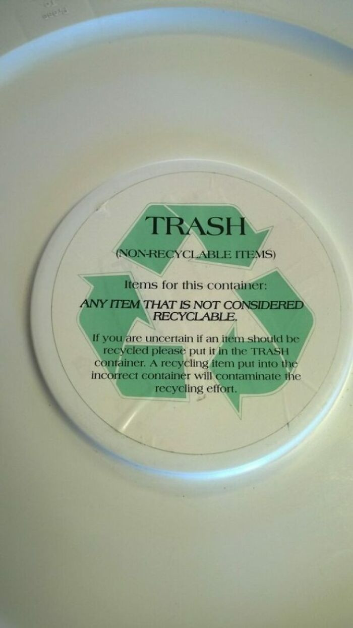 kimmbahley
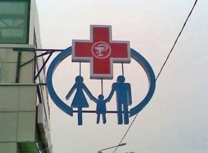
21. Logo Of My Local Doctor's Office
 tlvrtm
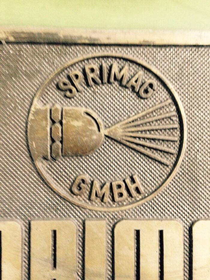
22. This Logo Of Czech Sausage Company
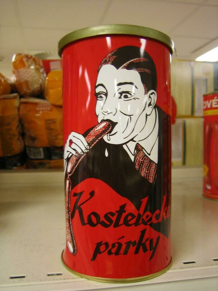 RadyoP
23. iSmart's Logo Really Thew Me For A Second
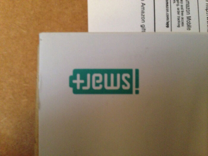 TinaTeaspoon
24. Your Logo Designer Is Still Laughing
 1morepic_really
25. This Is The Logo From A Local Dispensary
 TulsaIsMyCountry
26. Logo Is Having A Bad Case Of Diarrhea
 LordGhoul
27. The Logo For The 1973 Archdiocese Youth Commission
 Krackajak_78
28. Ordered Jordan's Online. Got Fake Ones, Jordan Logo Has An A*s Crack. Wtf Lol
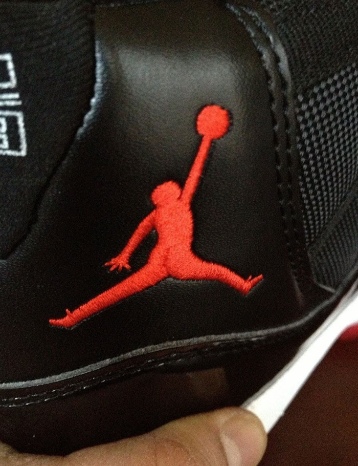 Hunchmine
29. Ontario’s Logo (Trillium Flower) Looks Like 3 Dudes In A Hot Tub
 GDML
GDML
30. The Logo For My Son’s IT Class At School
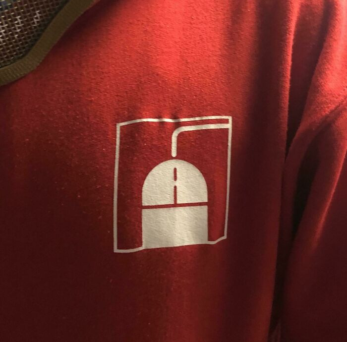 WarrenZevonsSkull
31. This Logo Of A Bird Also Looks Like A Character Wearing A Hat Puking
 bunsharu
32. Logo For A Children’s Hospital. Right Side Up Is A Man Juggling/Playing With Kids. Upside Down Is An Angry Man Stomping On Kids
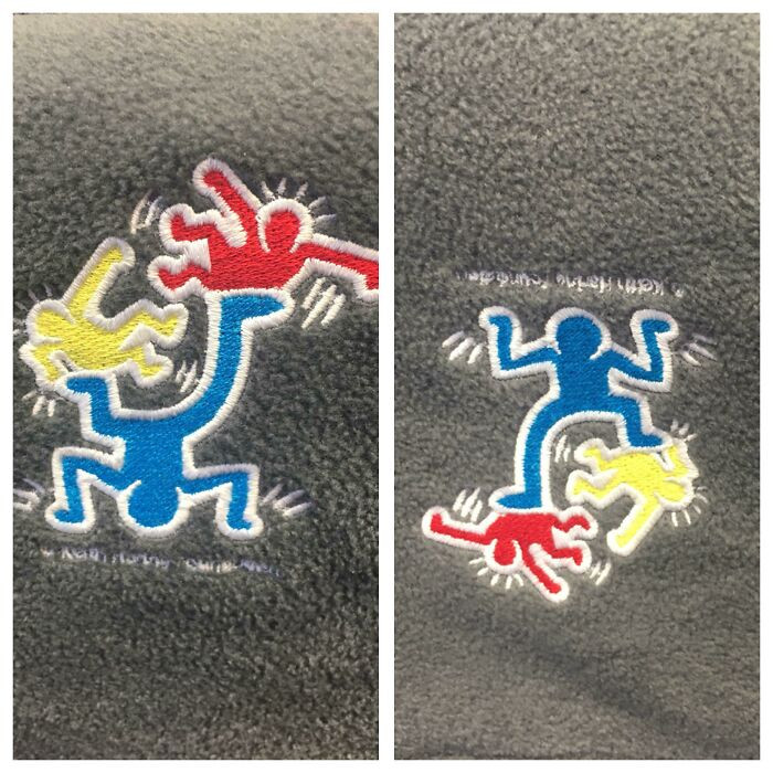 bb_or_not_bb
33. Not The Greatest Logo
 1aappyy
34. Business Center Logo Looks Like A Guy Taking A Dump
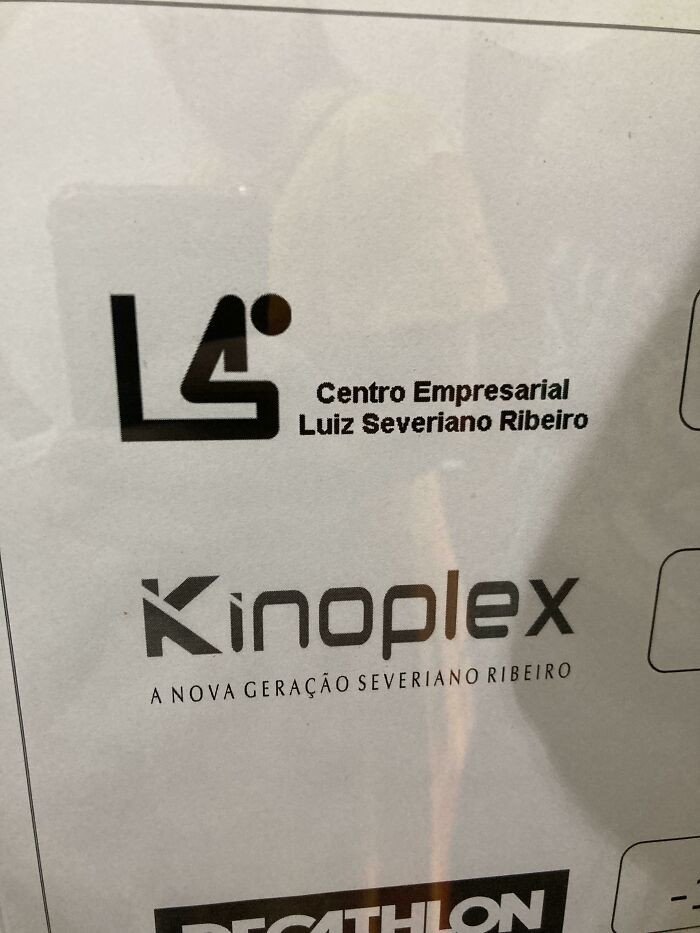 bernardo15
35. Probably The Worst Logo I've Ever Seen. It's For A Plastic Surgeon
 Phedericus
36. "Cass Toys" Didn't Think Their Logo Design Through Too Well
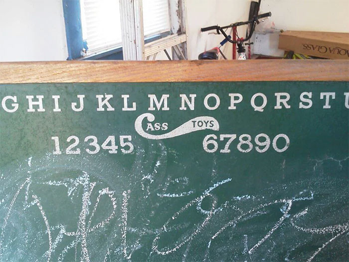 cthulhuscock
37. This Pet Supplies Company's Logo Is Meant To Depict A Cat And A Dog, But What I See Is A Dead Bird
 sentient_salami
38. The Unfortunate Logo Of A Florists Near Me. I've Been Calling It Std's For Years. It's Sid's
 Cupnooble
39. Vermont Maple Syrup Logo
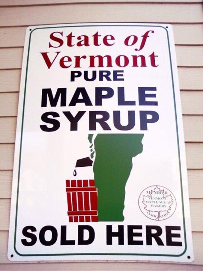 manfredaman
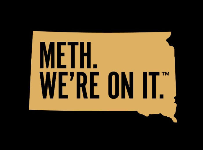
40. South Dakota’s Logo For A New Anti-Meth Campaign
 adamhasabeard
Keep in mind that you can always learn from the mistakes made by others and make the required corrections, even if things don't work out perfectly the first time. These illustrations demonstrate how, after devoting an excessive amount of time to a task, even the most capable people can occasionally fail.
Which of the unsuccessful logo designs did you like the most and why? Drop your responses below.
Maryjane


