

This Graphic Designer Redesigned The 9 Worst Logos Ever And Turned Them Into The Best Logos For The Company
A logo can make or break a company.
We all know that logos are pretty important to how people view your brand, and it forms a bit of a first impression on the brand itself as well. Logos are some of the harder things to design because it starts off the vision for the entire brand.
We know that they are important because most of us can remember and recognize the logos of many of our favorite brands. However, some logos just aren't that great and they are in need of a bit of updating when it comes to how they were designed.
That's exactly what this designer did for all 9 of these companies. This designer took some of the worst logos out there and transformed them into some of the best, most clever logos that they could've come up with.
We're actually quite impressed with how the logos came out after the designer got ahold of them. This is exactly why we wanted to share this article because it shows just how creative some people are when it comes to a vision.
So, without further ado, we're going to dive in and look at the before and afters of these logos and see just how much this designer transformed them.
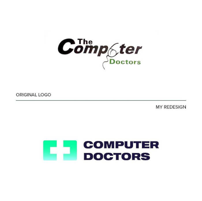
1. The Computer Doctors
This logo definitely is quite impressive and gives the idea of what their company is and what they are called.
 abrate_emanuele
[ADVERTISEMENT]
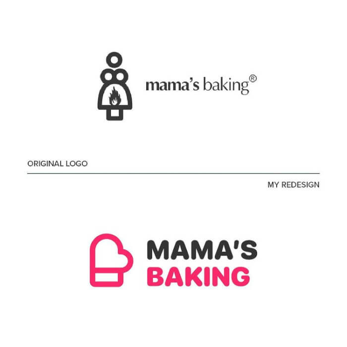
2. Mama’s Baking
We're not even sure what they were trying to achieve in the original logo, but the redesigned one is definitely impressive.
 abrate_emanuele
[ADVERTISEMENT]
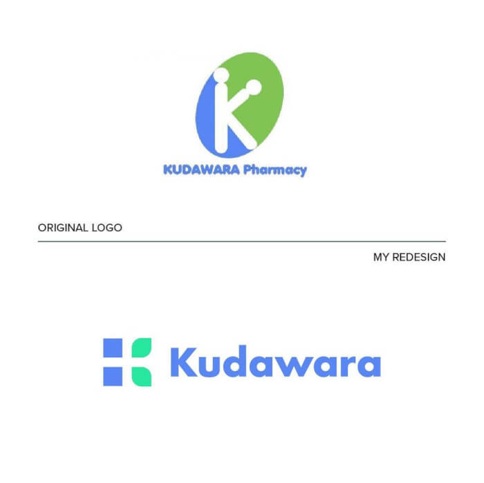
3. Kudawara Pharmacy
We love a logo that is sleeker and that has fewer words. Overall it definitely looks like a better logo than the first one that they had.
 abrate_emanuele
[ADVERTISEMENT]
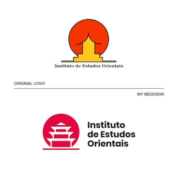
4. Institute of Oriental Studies – Santa Catarina University
This first logo is just awful as it definitely doesn't show exactly what they mean. The redesign captures the company much better without any weird imaging tagging along with it.
 abrate_emanuele
[ADVERTISEMENT]
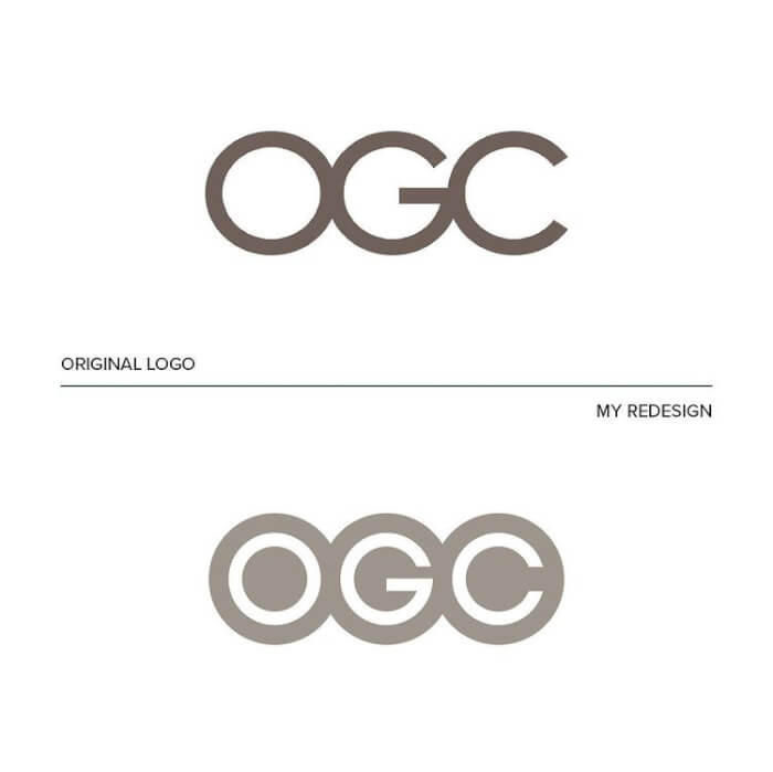
5. Office Of Government Commerce
The first logo wasn't exactly bad, but it was kind of plain. The outlines and details of the redone logo definitely make a difference even though not much changed.
 abrate_emanuele
[ADVERTISEMENT]
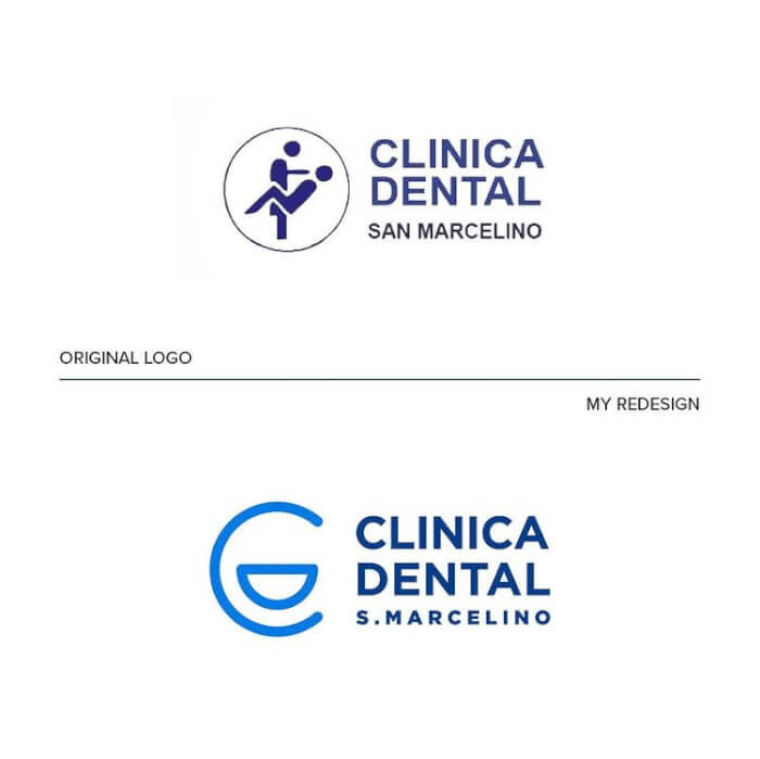
6. Clinica Dental
Now, this logo definitely doesn't portray exactly what's going to happen at the dentist's office and this is one that really did need some redesigning.
 abrate_emanuele
[ADVERTISEMENT]
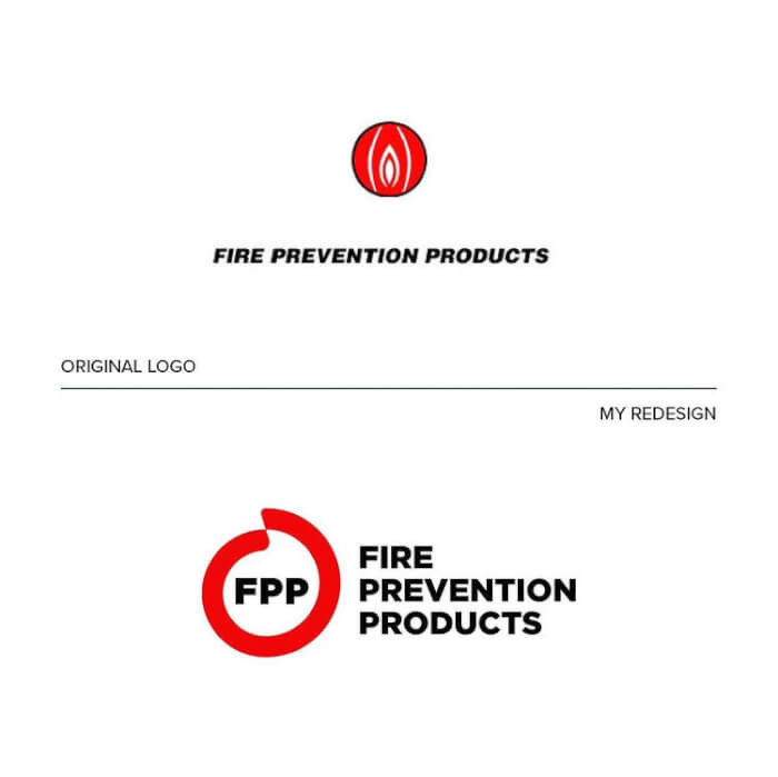
7. Fire Preventation Products
Now this logo doesn't look anything like a flame so I can understand why the designer chose to redesign this one and make it more fire-like.
 abrate_emanuele
[ADVERTISEMENT]
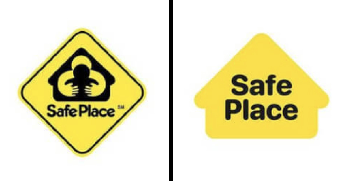
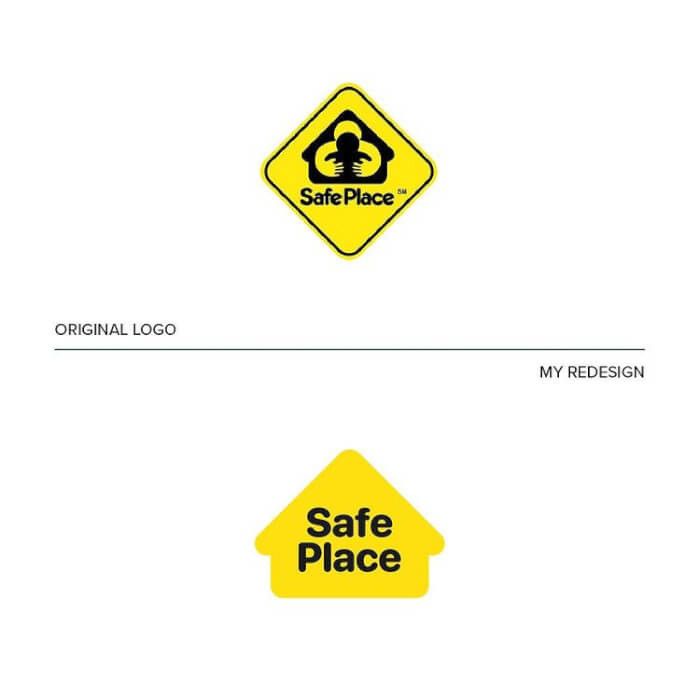
8. Safe Place
This logo doesn't really look anything like as safe place and it seems to give the opposite meaning. I'm assuming it's supposed to be a hug, but someone definitely messed that up.
 abrate_emanuele
[ADVERTISEMENT]
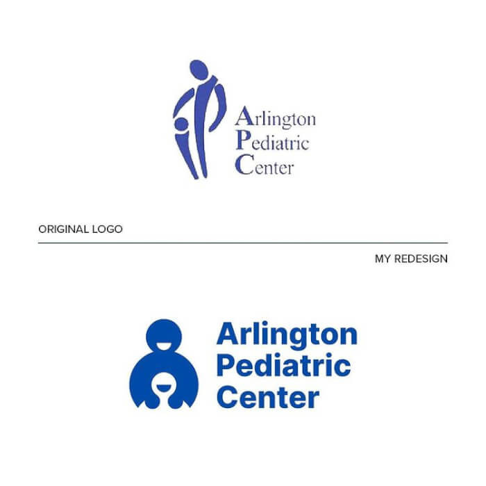
9. Arlington Pediatric Center
We don't even really need to say anything about this one.
 abrate_emanuele
[ADVERTISEMENT]
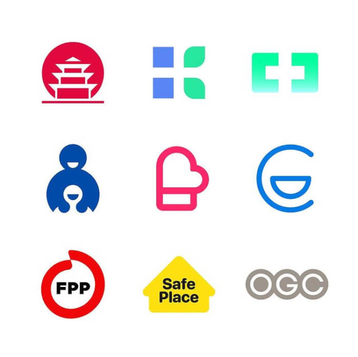
10. Here's an overview of all the logos that they redesigned.
 abrate_emanuele
[ADVERTISEMENT]
We are very impressed with these logos and how the designer really captured the vision of the brand. We're happy that someone could get rid of these terrible logos because they definitely didn't give off the vibe that the company was all about.
What do you think about these?
Daphnie


