
50 Designs That Totally Deserve Prison Time, But An Online Group Has Decided To Shame Them First
The entire sub is a crash course in taste
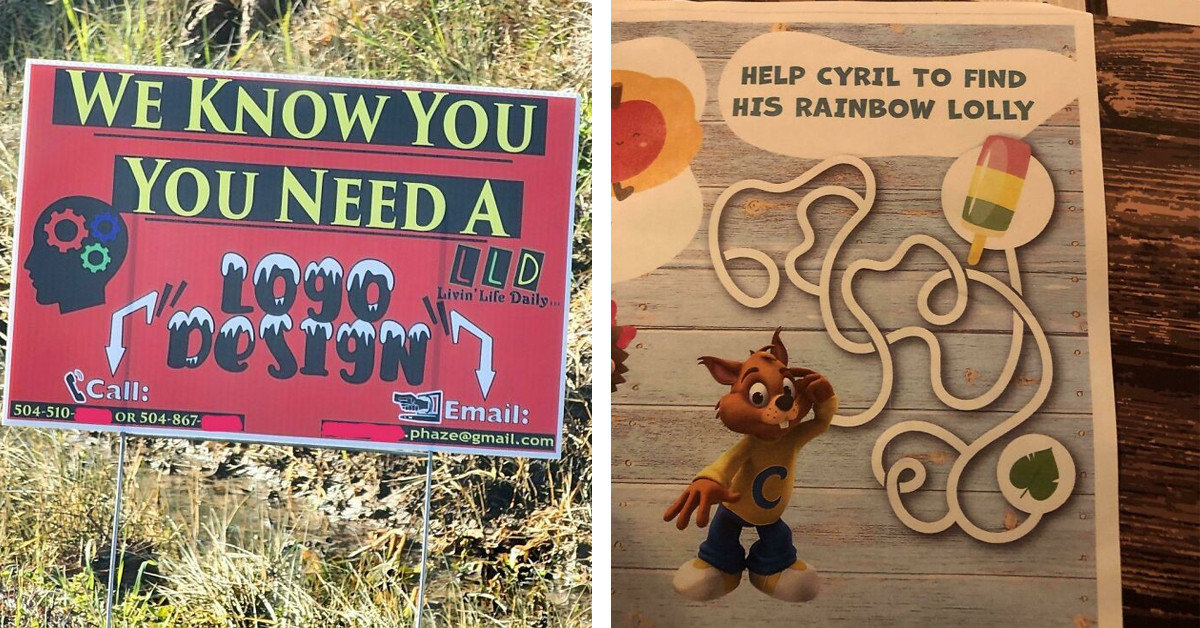
All of us experience times in our lives when we stare around in disbelief, wondering where all the quality went and why we are surrounded by shoddy, ugly rubbish. Theodore Sturgeon, an American science fiction writer, and critic, is credited with the notion that "ninety percent of everything" will be garbage.
Sturgeon's Law is well known, and it has an impact on all facets of life, including design. This wildly popular subreddit steps in to help with that.
Since its creation in 2011, the terrible design-focused subreddit has racked up an impressive 3.4 million followers. And there are many wonderful things about the internet group.
Instructions are given to the community's millions of members to be as original as possible. As a result, if you're a new Reddit user, review the top 150 posts in the sub to learn what not to share with the community.
Don't be afraid to do some research; everyone prefers fresh information over the same old carousel of images. Even if they appear to be poor on the surface, certain designs are actually good, according to the team in charge of the group.
In order words, it's an online community devoted to showcasing the most epic and famous design blunders, from embarrassing to downright absurd. You can enjoy our list of the most recent worst offenders.
1. This Infographic Uses Blue For Hot And Red For Cold
 firstfatmaninspace
2. The Sweater I Bought Cannot Be Maintained
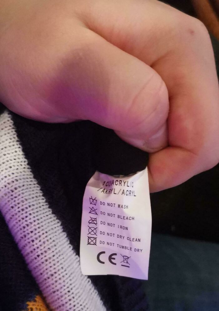 FuzzboarEKKO
3. The Last Two Steps On These Stairs Are Higher Than The Previous 50
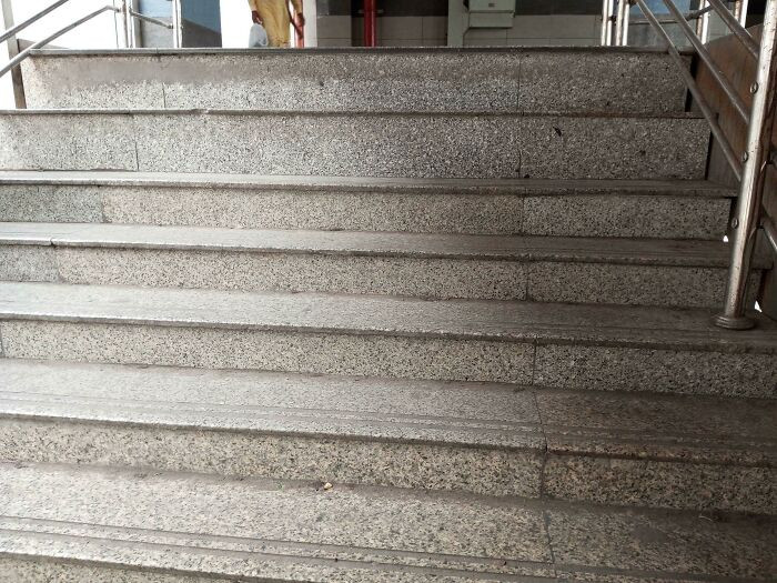 david_pridson
4. I Now Have Trust Issues With Cooking Instructions
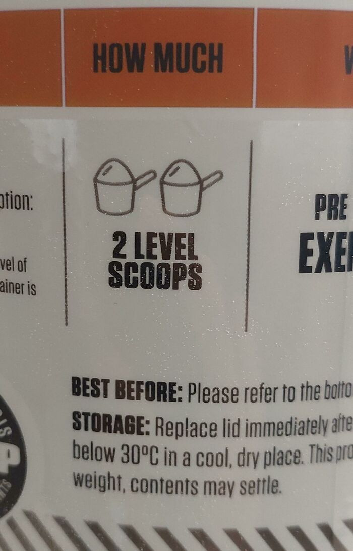 bartolemew
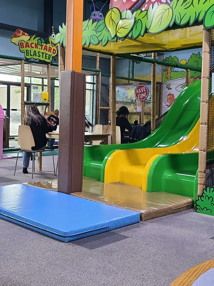
5. At Least It's Padded?
 cheekymrs
6. The Land Is Blue And The Water Is White. I Am Not Proud To Say That I Spent Multiple Minutes Trying To Figure Out Why All The Cities Were Underwater
 meme_planet_13
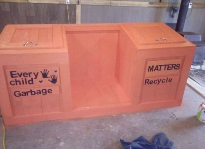
7. Just Feel Bad About This One, Good Intentions Gone Wrong
 toastisfree
8. Probably The Worst Logo I've Ever Seen. It's For A Plastic Surgeon
 Phedericus
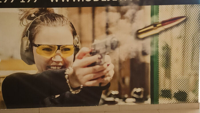
9. This Shooting Range Ad That Shows A Gun Firing A Cartridge
 chonk_dogg
10. Horse With Eyes On Front Of Its Head
 Better_Weakness7239
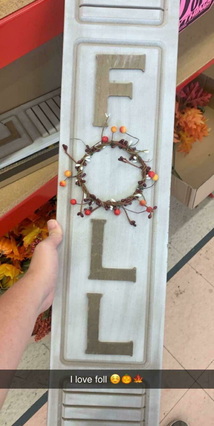
11. Foll Is My Favorite Season
 martrocks
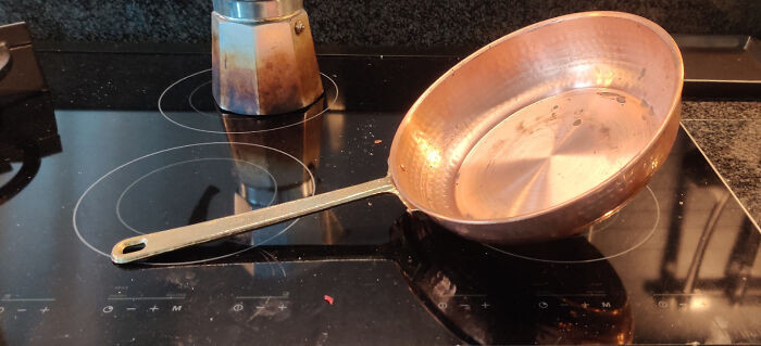
12. The Handle Of This Pan Is Heavier Than The Pan Itself, Making It Fall Over Immediately
 Hell_Awaitz
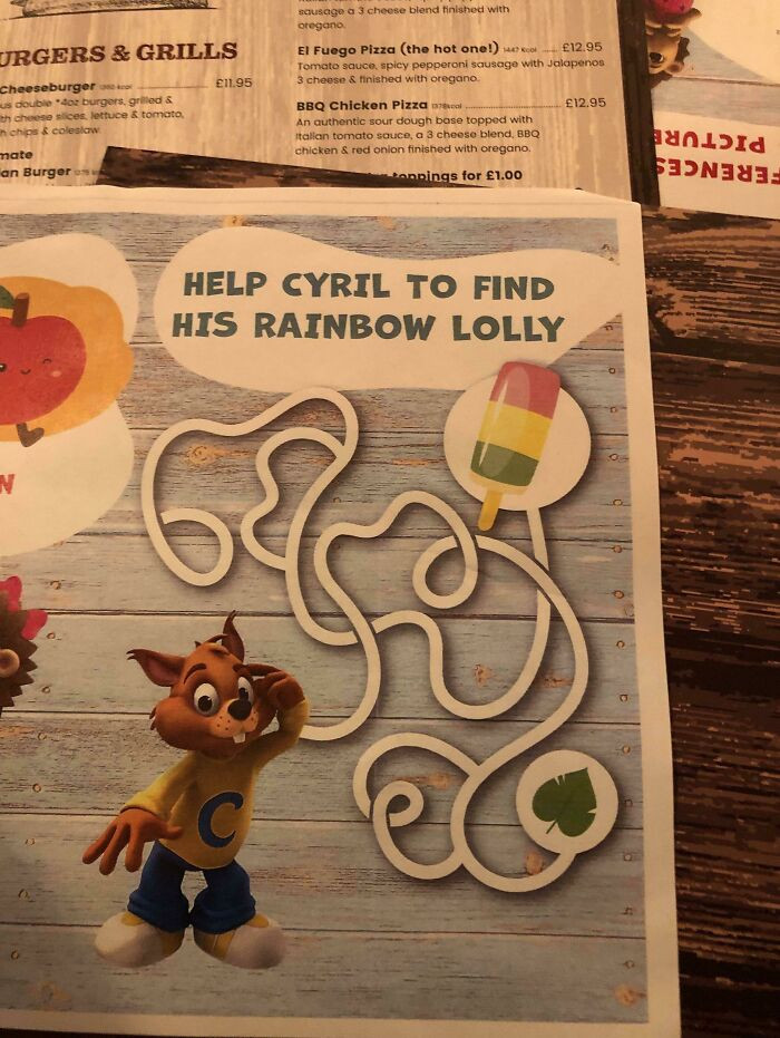
13. There Is No Way To Complete The Puzzle
 Heam21
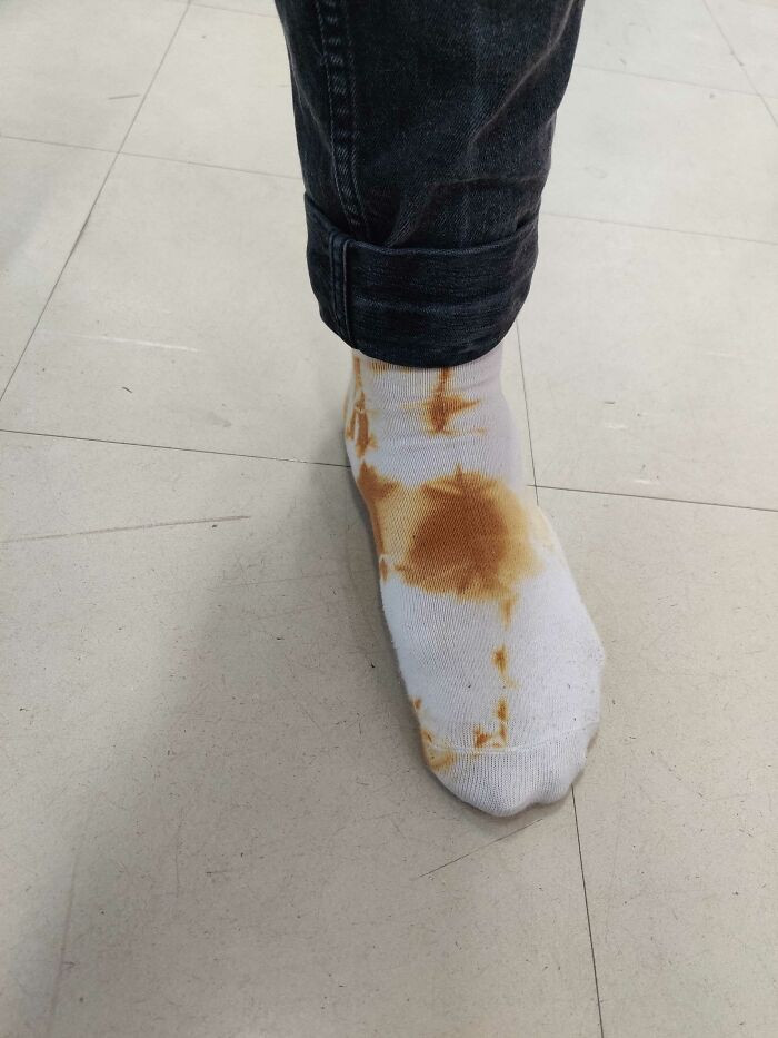
14. Tie Dye Socks That Look Like Someone Used Them As Toilet Paper
 Professional_Lunch43
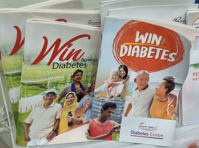
15. Prizes On Offer At The Clinic
 BaronVonStretchmark
16. Restaurant Bathroom Sink, Made From... Wood
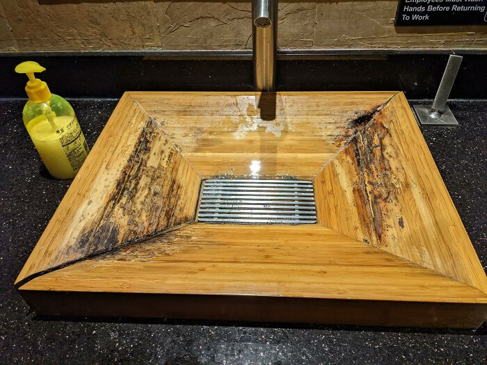 duucfho
17. Slippery When Wet, I Fell Down Just Looking At The Picture
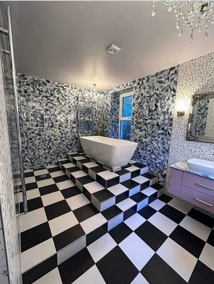 KlassyKlutz
18. Arms (Found On A Cruise Ship I Was On Last Week)
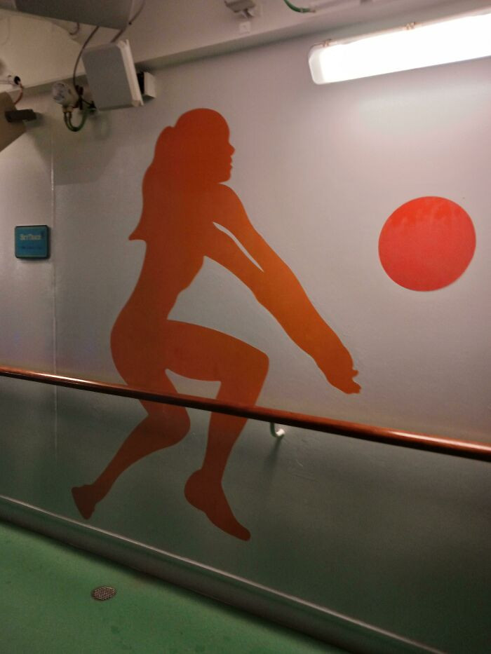 Go_Crazyyy
19. Good Old 'Ondon
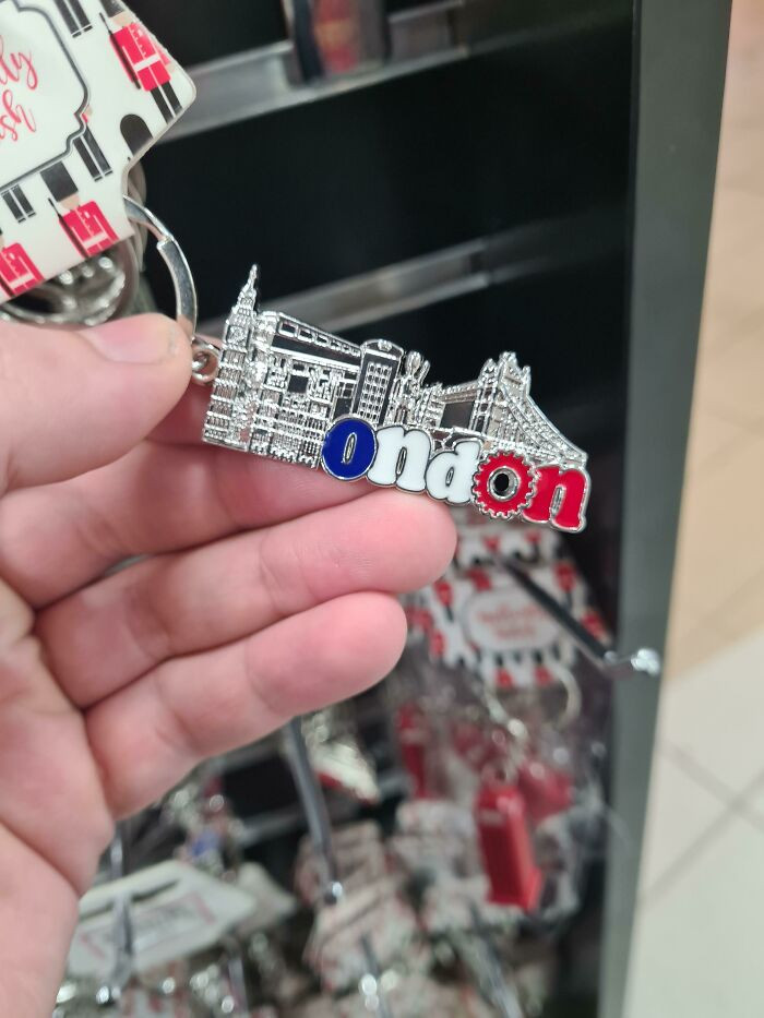 Cybersponge94
20. Fly To Europe And Have A Stroke
 DucksToo22
21. For Reasons Unknown, South America Has Completely Been Replaced By Africa
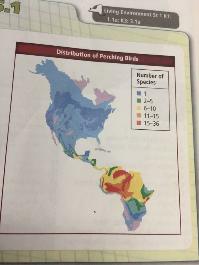 logstain
22. This Poor Design On A Real Estate Agent's Building
 wanderingbrother
23. Each Of The Blue Dots On This Fire Escape Map Says “You Are Here”
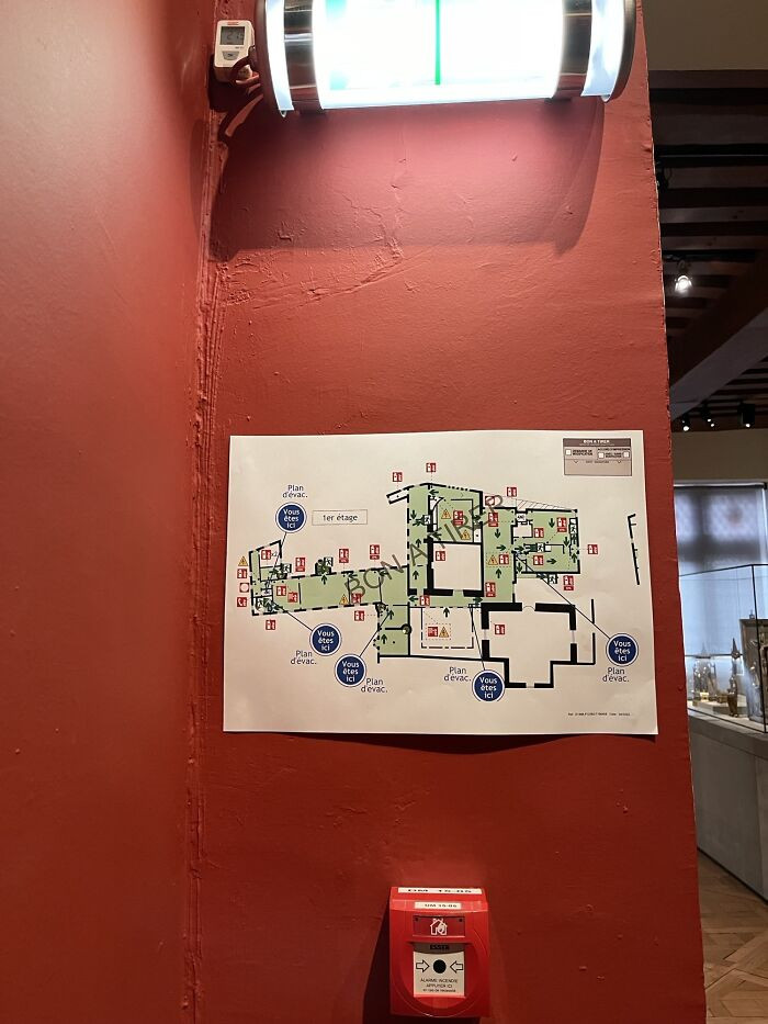 EmmaStonewallJackson
24. Stainless Steel Bench At The Beach. The Temperature Today Is 31°c
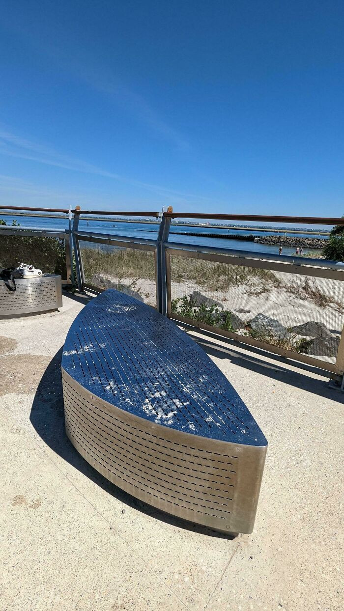 unfederica
25. The Words They Chose To Have Standout Color
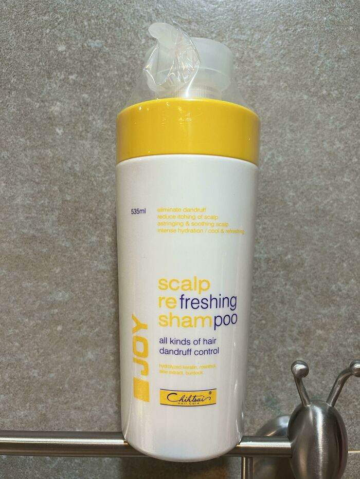 hansolo625
26. Quite The Opposite Of An Open Concept Kitchen
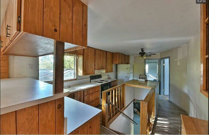 Dahneeze
27. Door Knockers On Glass 👌🏻
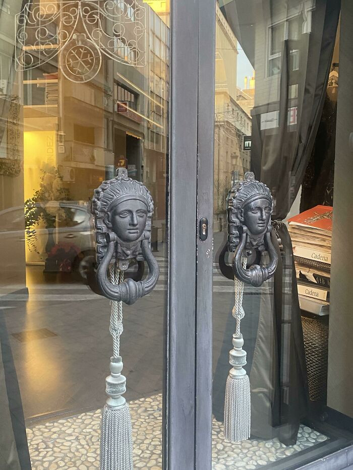 llandbeforeslime
28. One Is A Toilet Cleaner, The Other Is For Washing Dishes. Choose Wisely
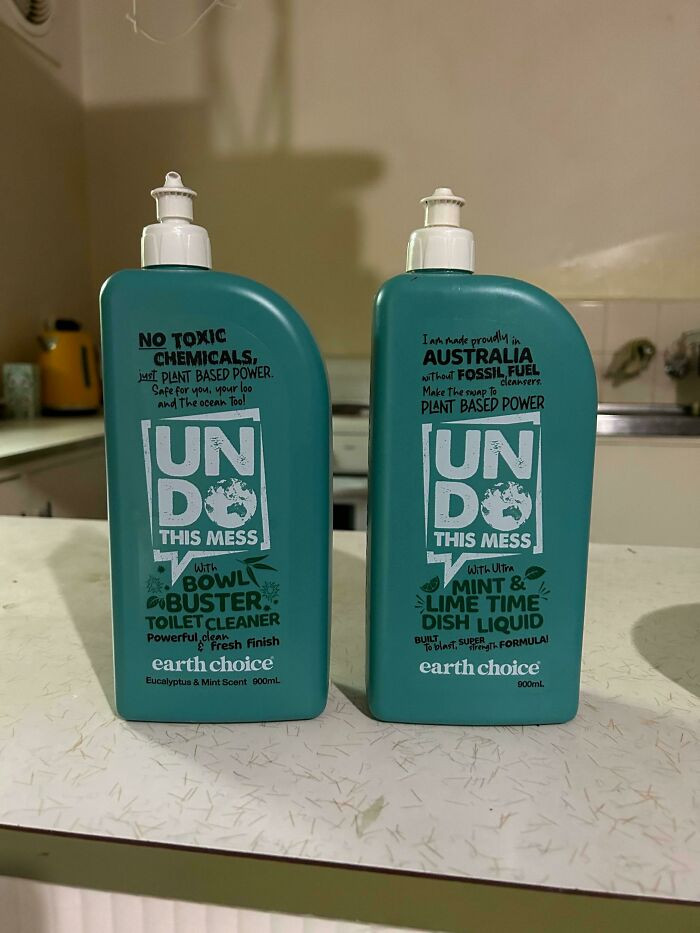 Jonlevy93
29. This Double Sided Exit Sign
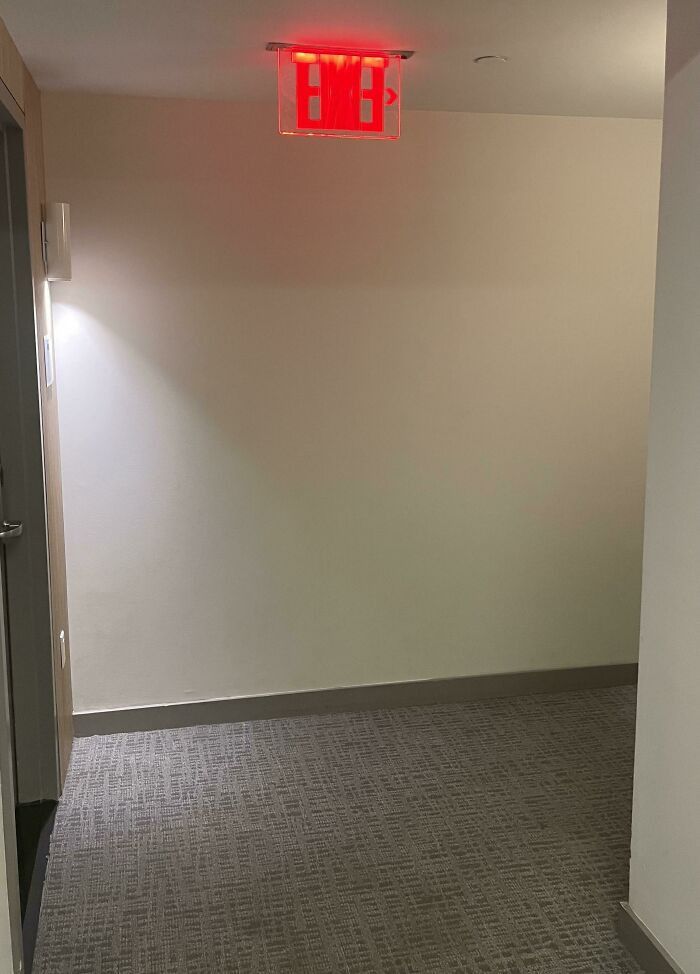 superaa
30. Probably Wouldn't Be Such A Bad Idea If Every Angle Wasn't Slightly Off
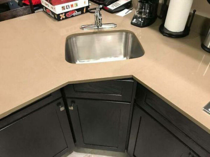 Any-Classic-5733
31. Someone Put Up This Sign On A Corner Near Me
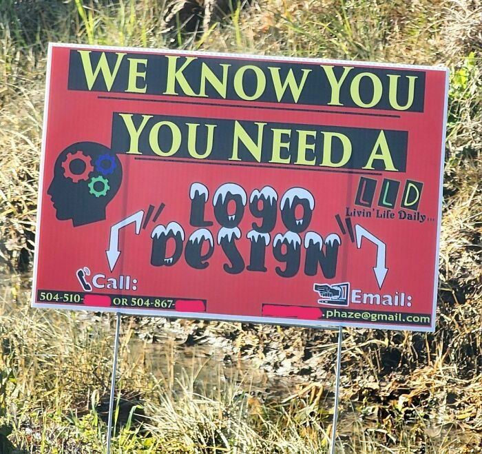 tactiphile
32. Simultaneously Too High And Too Low - This Dress
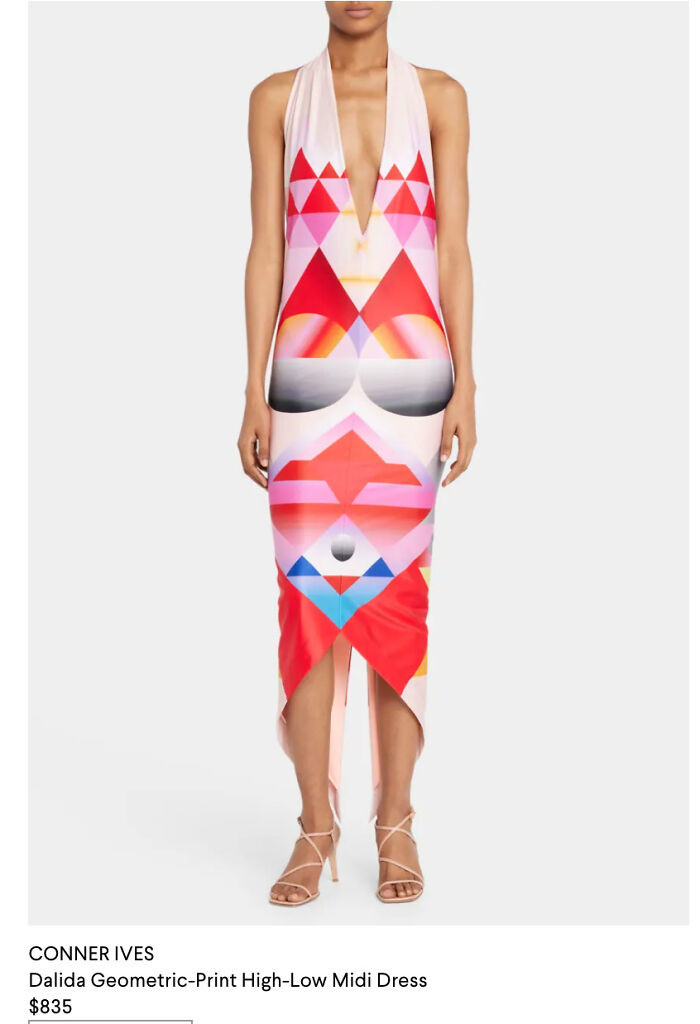 Tessa7
33. “Thou Shalt Use 24 Point Font. Thou Shalt Not Use 23 Unless Immediately Proceeding To 24. 22 Is Right Out!
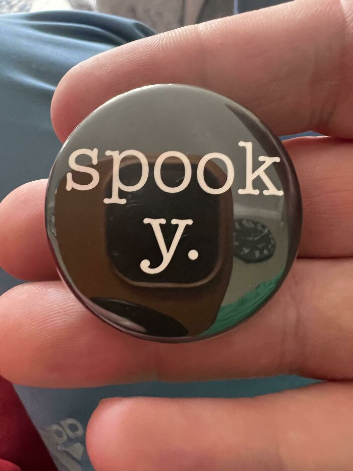 Fazioliphotography
34. Toilets For Disabled People Are Located Upstairs In A Restaurant In Stockholm
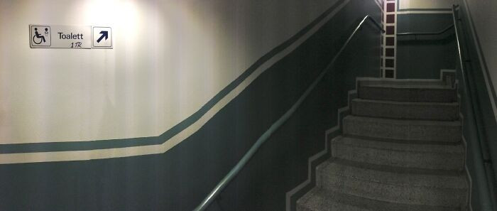 momo_power
35. This Map At A Coffee Shop
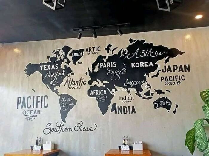 Holzweg34
36. May I Have A Wednesday, Please
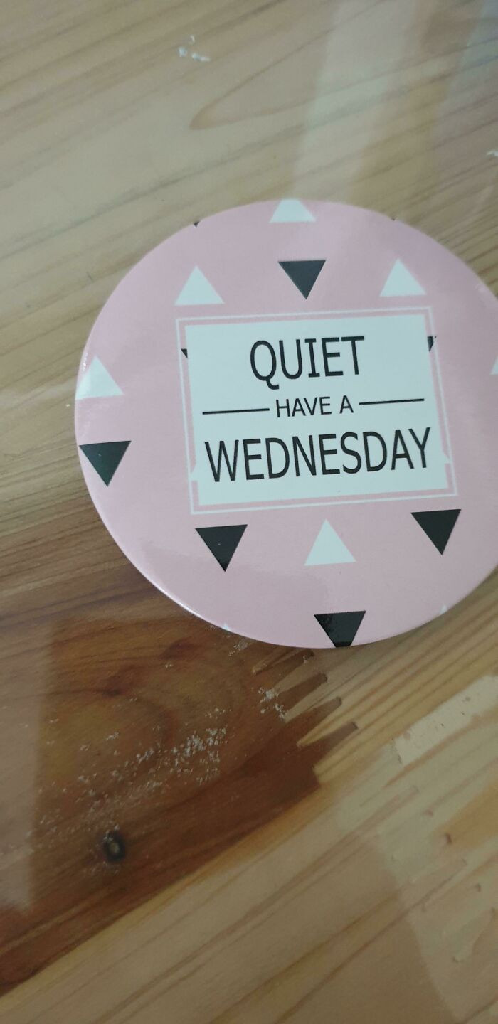 _Goodrandom
37. I'll Take Your Sofa Kitchen And Raise You This Tangled Line Kitchen (With Line Covered Appliances Hidden Against The Wall)
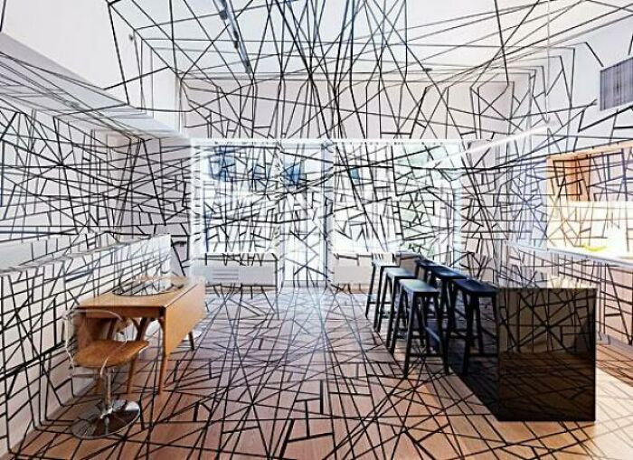 -avoidingwork-
38. My Son Who Just Started To Read, “Hell Baby. Hell Baby. Hell Baby!!!”
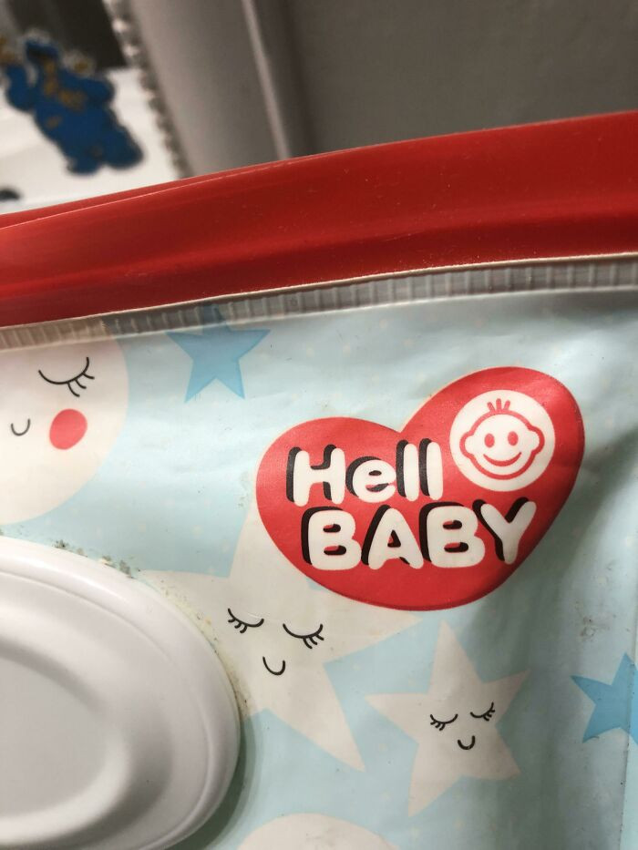 Hopeful_Relative_494
39. Whoever Edited This Photo To Sell D&d Dice On Facebook Doesn't Know What They're Actually Used For
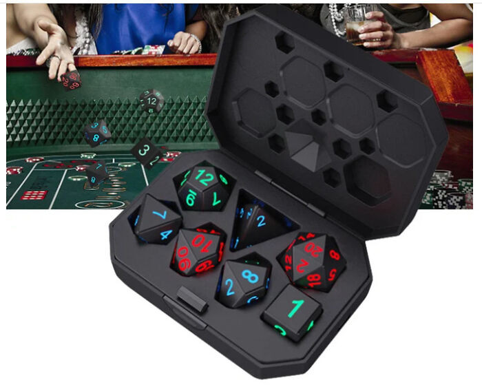 missmaggy2u
40. Pikachu What Have They Done To You!?
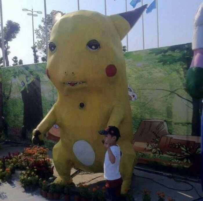 Mellowlyhunger347
41. Mmm Yes, I Sure Do Love Living In Tevas
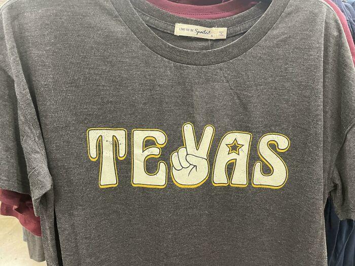 TheAverageYBAJoe
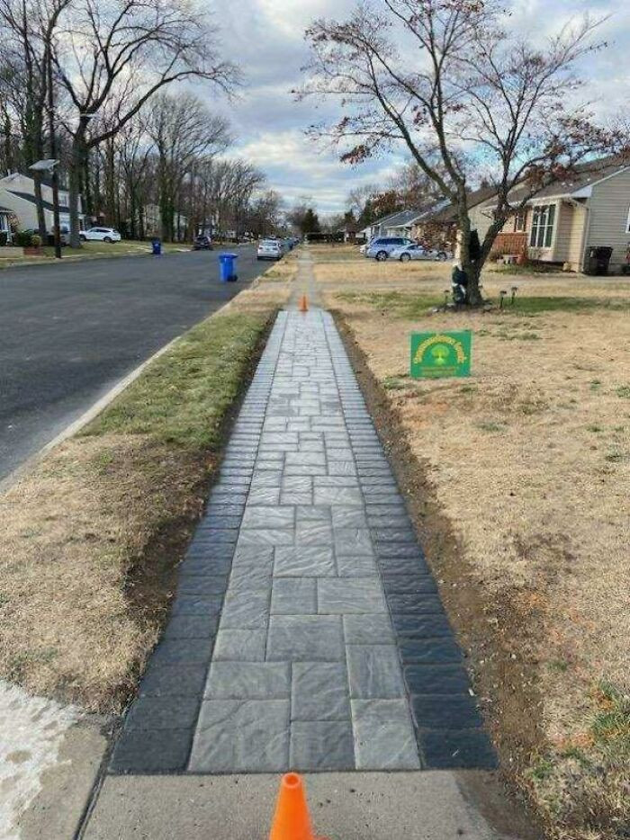
42. Neighbors Went Upscale In Their Sidewalk Replacement, But Picked Incredibly Slippery Pavers
 KSMO
KSMO
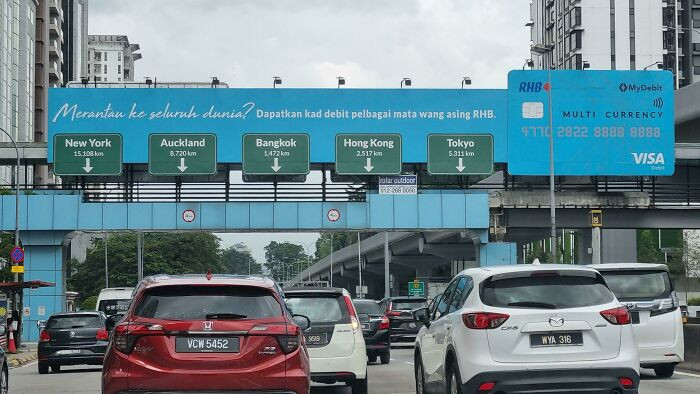
43. Ad On The Road That Imitates Real Street Signs
 AboutHelpTools3
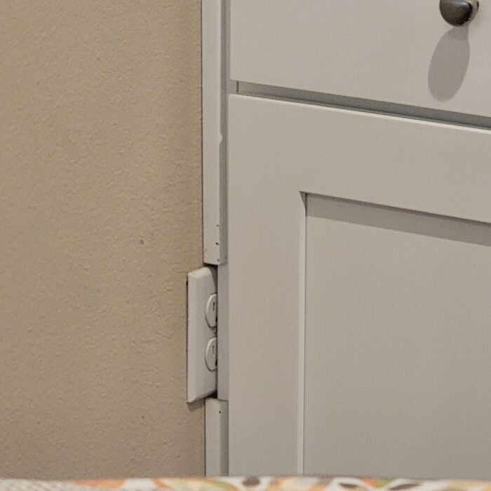
44. My Grandma Bought A Condo That Was Built In 2018, I Just Noticed This
 dbnrdaily
45. A Life-Changing Experience
 froopy_doo
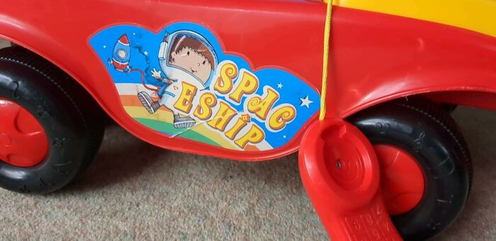
46. Ride On Spac Eship
 pruaga
47. Hotel Room Light Switch Hidden Behind Pillows, So You Wake Up Inexplicably In The Middle Of The Night
 philfr42
48. Every One Of Them Is Playing On The Wrong Side Of The Capo
 MikeOwen91
49. Business Center Logo Looks Like A Guy Taking A Dump
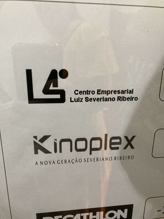 bernardo15
50. Sock Model Not Wearing Socks
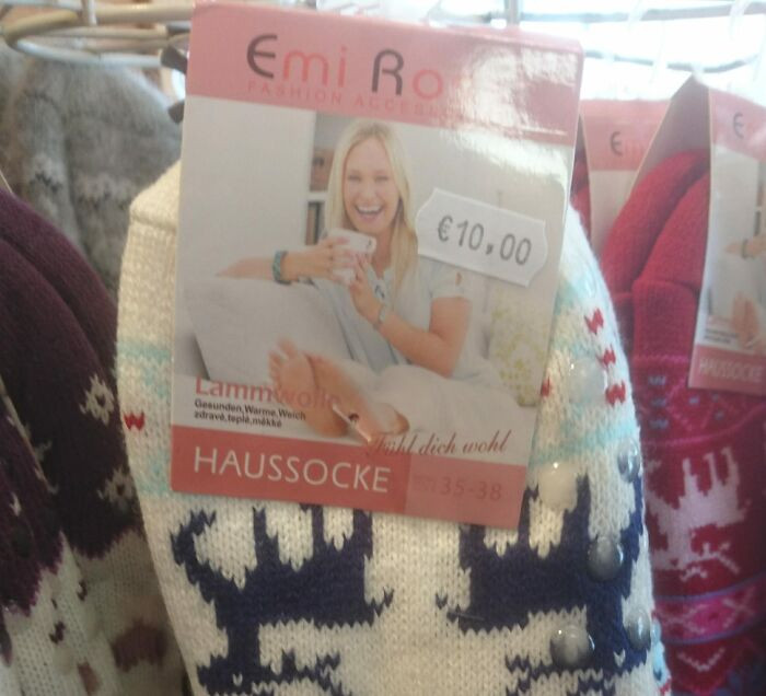 DressedNuthatch
Being a competent designer requires excellent communication skills and in-depth subject understanding. But these ones just did a floppy job.
Please feel free to stop by the comments section in the meantime and let us know which of the designs on this list you liked or loathed the most. What are your top picks for the positions as we have our selections in mind.
Maryjane


