Clever Graph Shows The Most Common Birthdays In The US
Is there really a "mating season" for humans?
I am sure a lot of us have quite vivid memories of asking our friends when their parents were born to try and figure out if they were born nine months after a special occasion. Turns out, this humorous, and frankly, a little gross theory, while just the stuff of kids’ jokes, may actually have some truth to it.
A Redditor has got a hold of the official birthday statistics and turned it into a neat graph for us all to understand. Check it out below to see whether you have a common, or uncommon birthday and see if you will need to start sharing your cake!
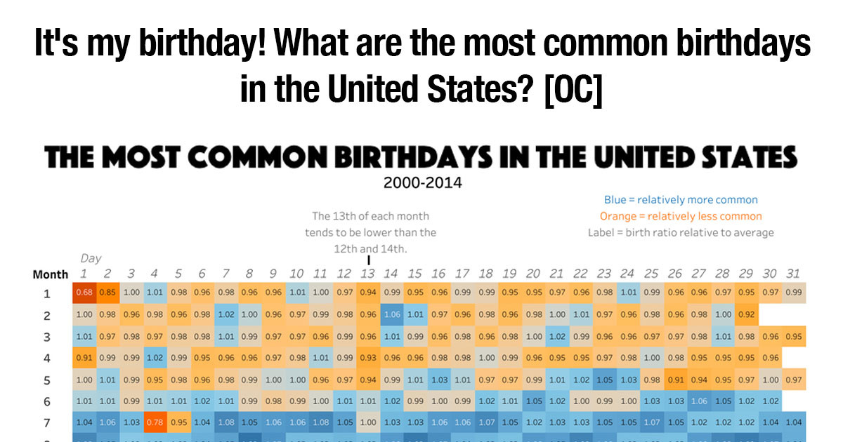
Reddit user u/BoMcCready made this incredible chart that shows all the days of the year colour-coded by the number of birthdays.
The blue days are more common, while the yellow are less. The grey dates are average.
[ADVERTISEMENT]
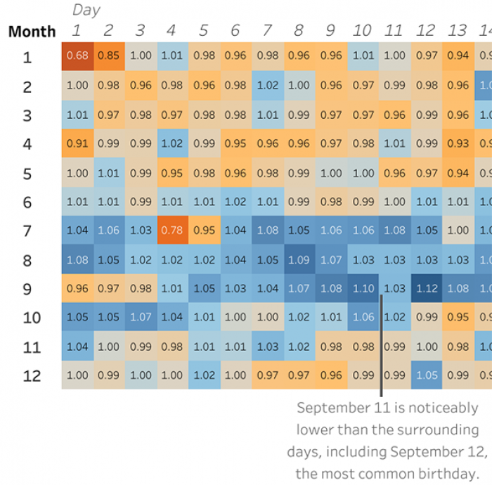
Here's a zoomed in version...
For the data-nerds among us, the numbers in each box show the margin by which the birth rate exceeds or doesn't meet the average--which is 1. Values bigger than 1 are more popular, whereas lower values mean that it is a less common date.
 Reddit user u/BoMcCready (via Bored Panda)
[ADVERTISEMENT]
There are relatively more birthdays in the US summer months, June through October.
 Reddit user u/BoMcCready (via Bored Panda)
[ADVERTISEMENT]
The most common month is September. Approximately 9 months after the holiday season... coincidence?
[ADVERTISEMENT]
The least popular birthdays include December 24th and 25th (Christmas), January 1st (New Year's Day) and the US Day of Independence (July 4th).
This takes into account people being induced or having c-sections, who often get a little more choice in the date!
[ADVERTISEMENT]
Reddit users loved the information!
 Reddit
[ADVERTISEMENT]
People awkwardly loved to do the calculations...
 Reddit
[ADVERTISEMENT]
Though some people were a little more crass about it!
 Reddit
[ADVERTISEMENT]
People LOVE the festive season
 Reddit
[ADVERTISEMENT]
Others wondered whether it differs around the world...
 Reddit
[ADVERTISEMENT]
What do you think? Do you have a common birthday? Let us know in the comments.
Find the full post on Reddit here.
And, regardless of the day, we hope you have a very happy birthday--wherever it is in the year!
Rachel